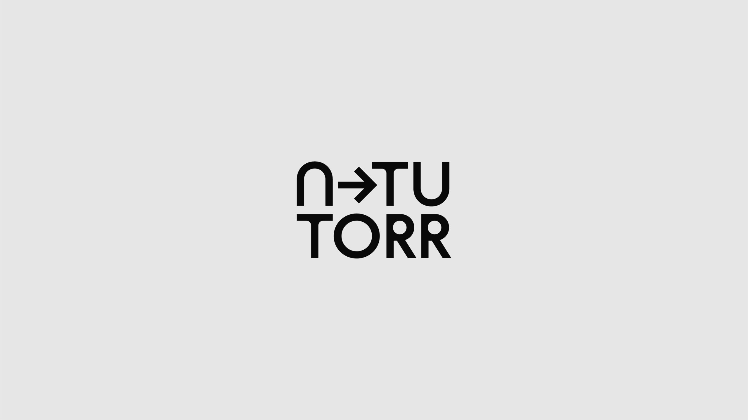
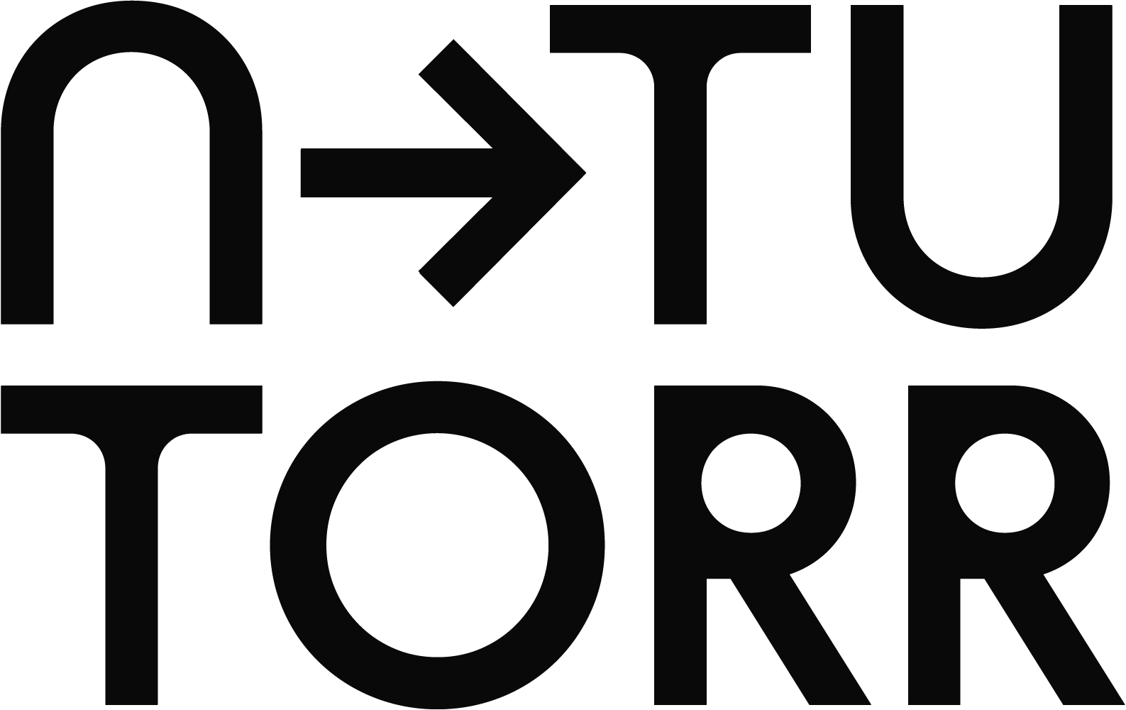
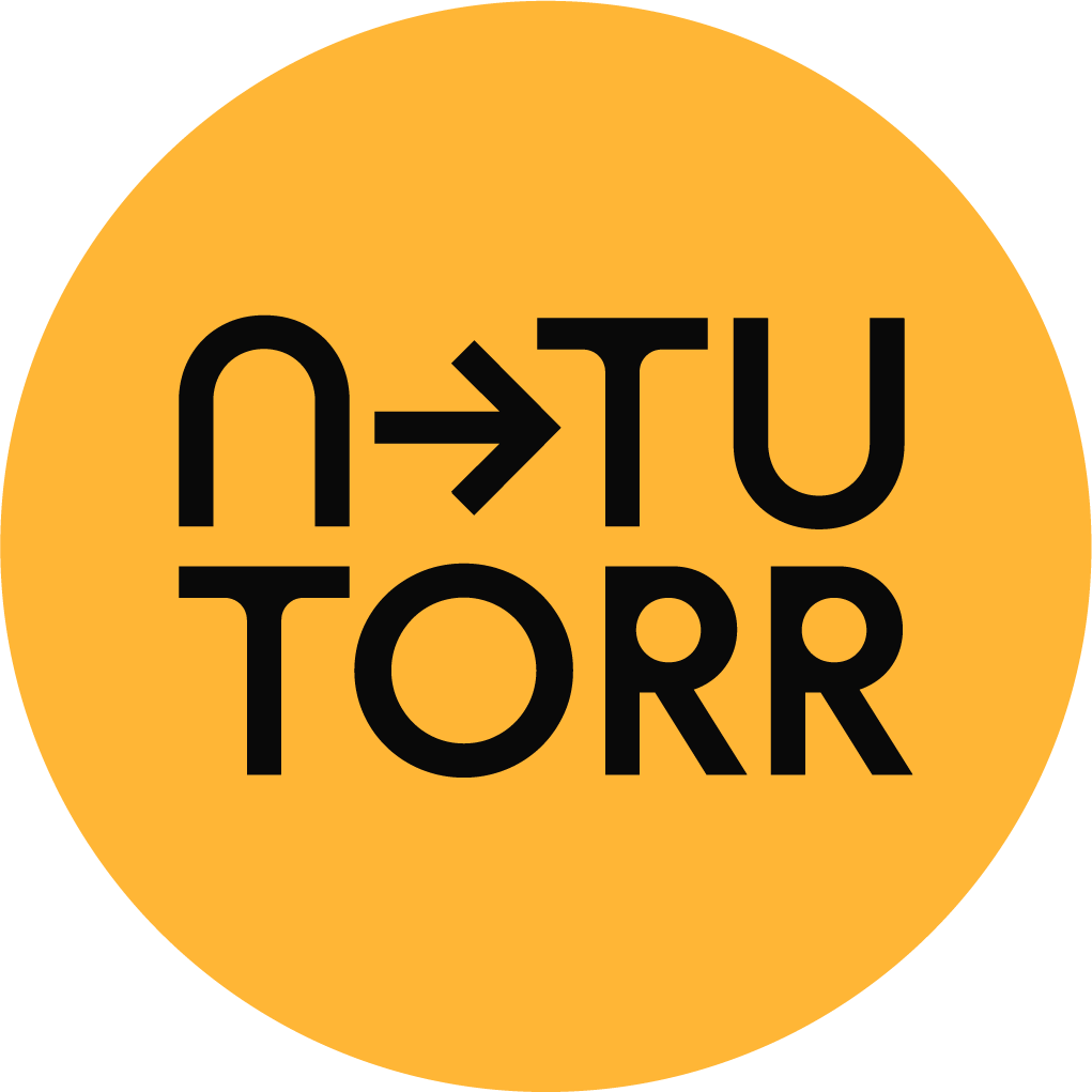
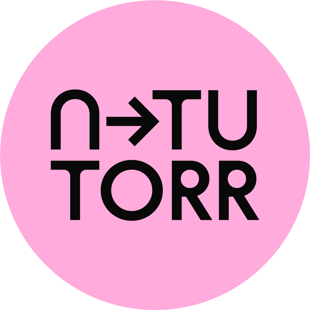
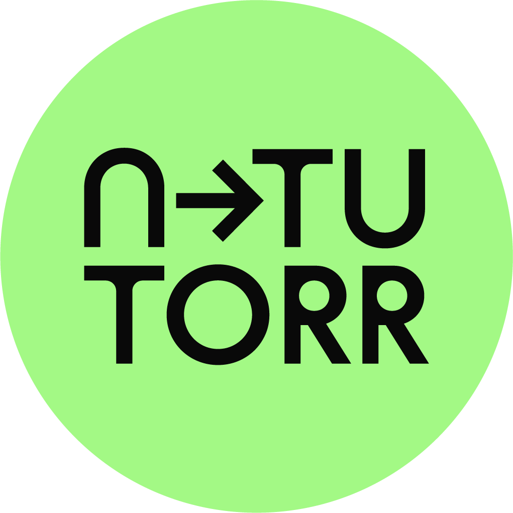
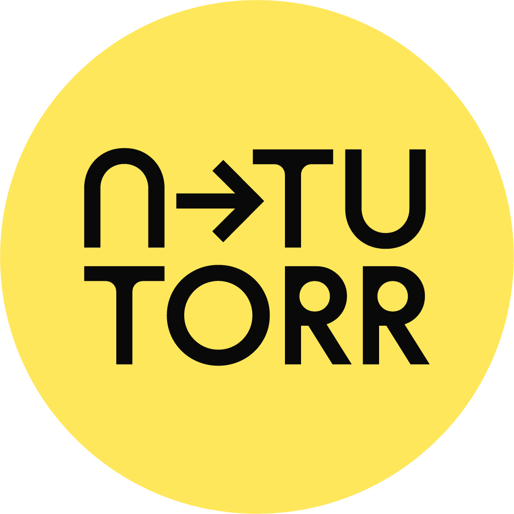
The Logo
Our new wordmark is a reflection of the brand language, its geometric structure is underscored by warm, open forms. A combination of the letters NTU stacked above TORR punctuated by an arrow between the N and TU aims to help in the pronunciation and ease of use. A selection of approved formats, files types and colour versions are available to download below.
Jump to
Logotype
The logo has been crafted and optimised to allow for use as a large identifier on all comms and equally it preforms well at small sizes.
Downloads available
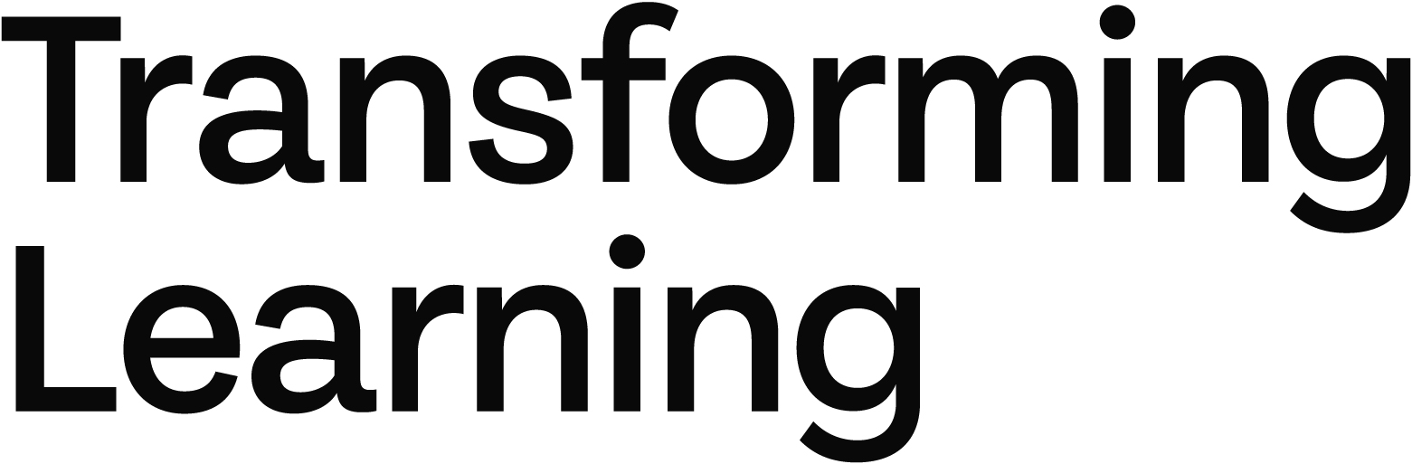
Strapline
The strapline is to be included on all pieces of marketing comms where the logo is present. It should not interact with the logo but should be clearly visible normally in the opposite corner to the logo. it can run horizontal or vertical.
Downloads available
Logo and Strapline

This logo is for third-party use.
Downloads available
Minimum Size & Clear Space
The minimum size measurements help to ensure the legibility of the logo. Clear space is the area around the logo used to protect its legibility. The space is equal to the width of the letter N from the logo.
Dos & Dont’s
Always ensure the logo is clearly visible and contrasts with the background.
Always use the correct artwork.
Do not alter the logo artwork files.
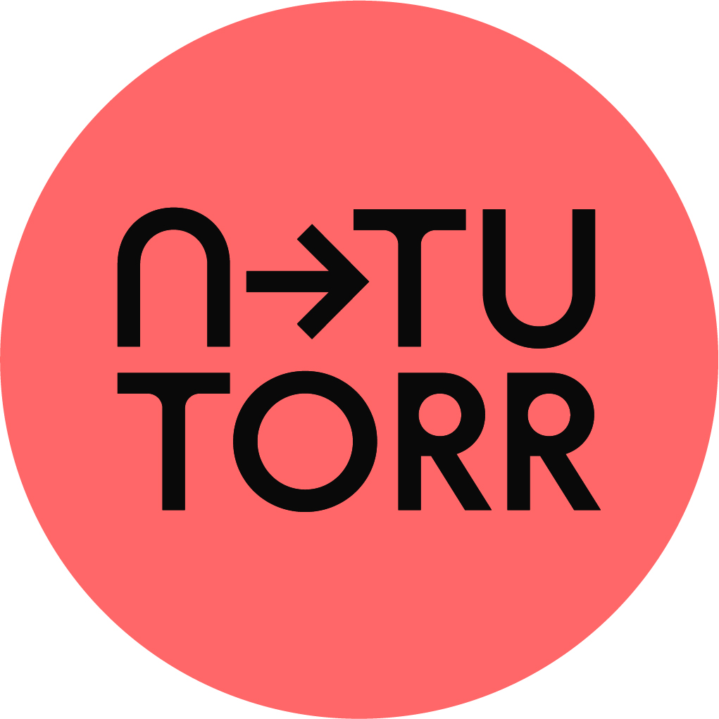
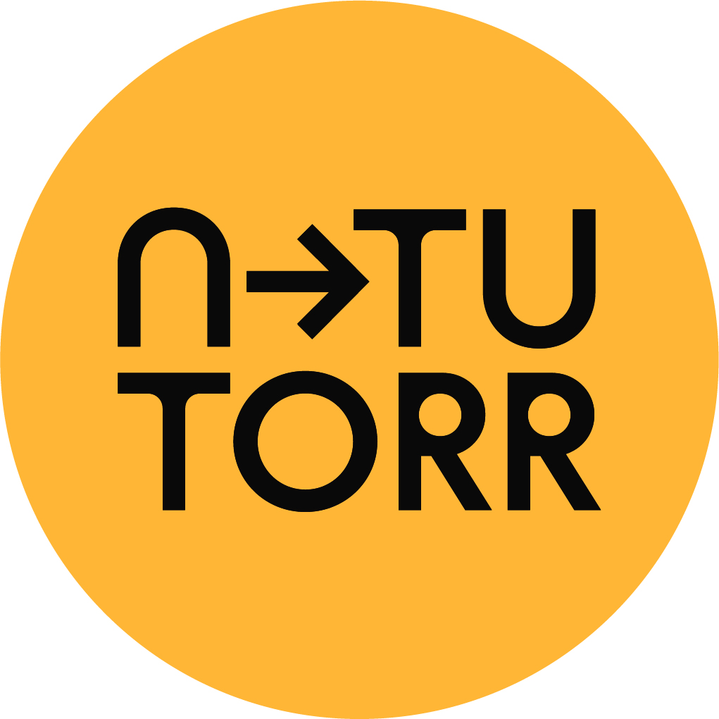
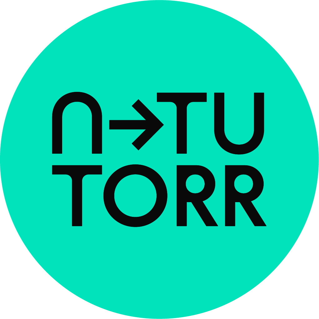
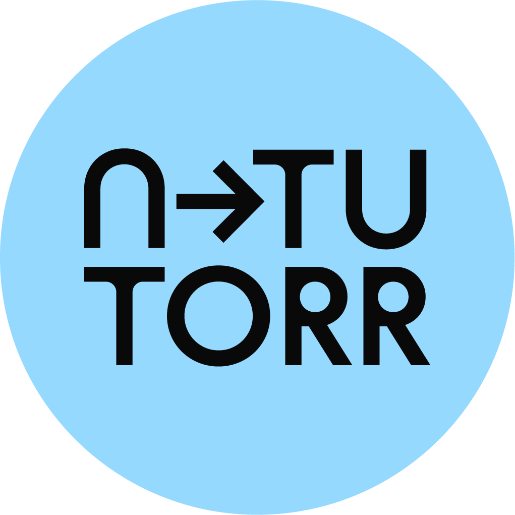
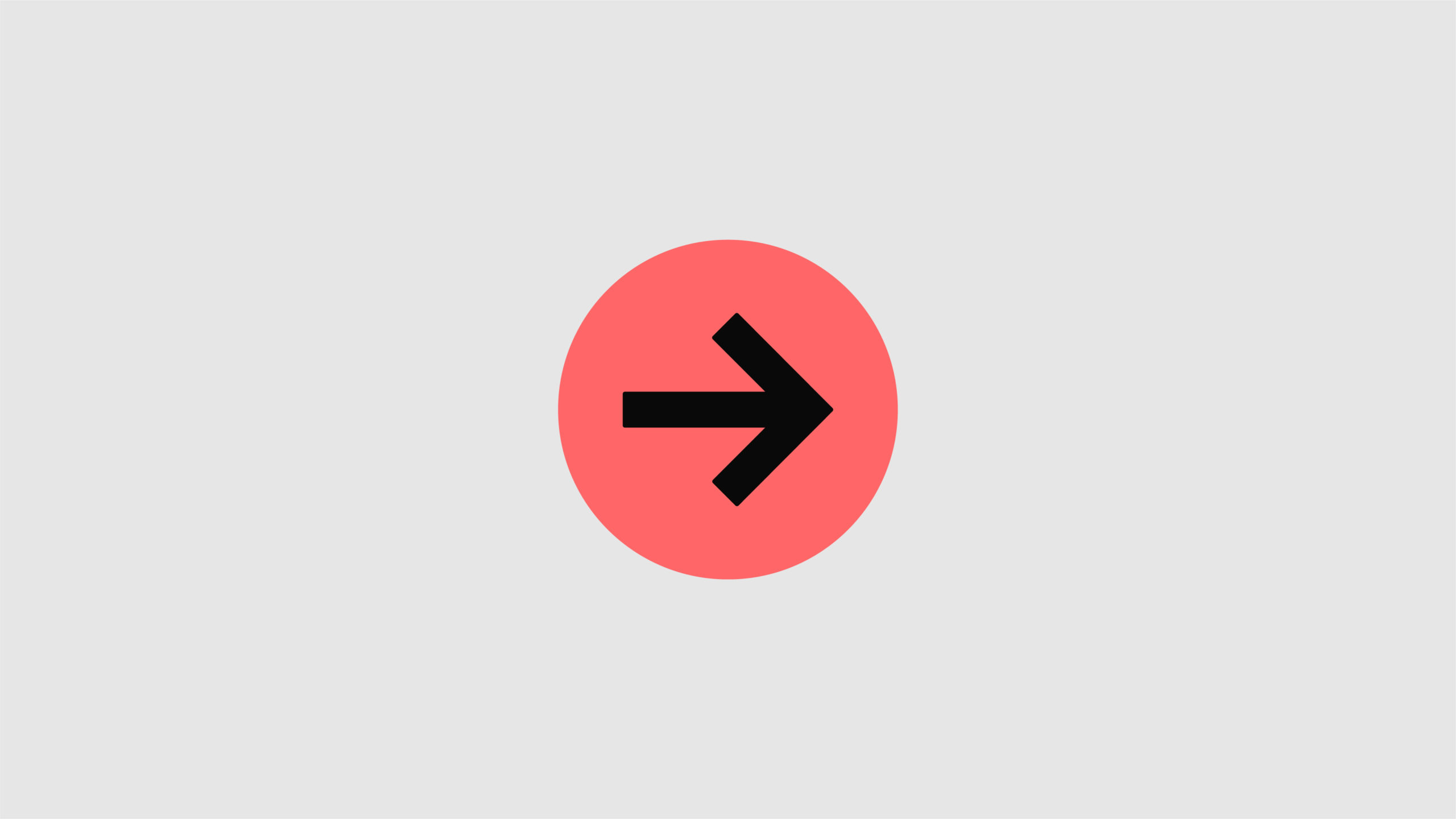
Avatar
The avatar has been developed for social media profile pics and other instances where the strapline can be displayed somewhere else on the comms.
Downloads available
Favicon
For use as web browser icon, could also be used as Avatar when the brand becomes more well known.
Downloads available
Next up